

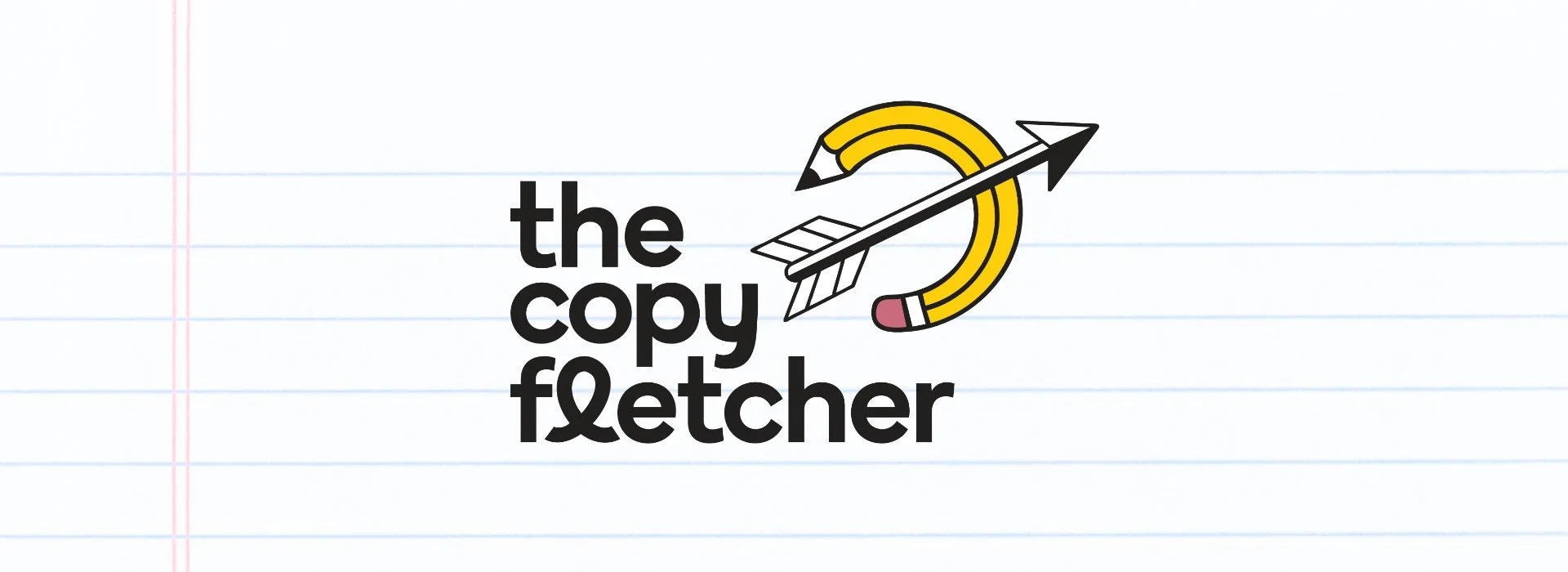
The Brief: The Copy Fletcher wants to build their authority as an always-curious copywriter with a touch of irreverence. A “fletcher” is a maker of arrows and an important symbol of onward motion that the founder, Gizelle, wanted to keep in the visuals from their original logo. Gizelle loves the color yellow but wants to amplify the overall palette and vibe to help them stand out on a crowded LinkedIN feed. The ideal client for The Copy Fletcher is an entrepreneur, so the updated branding needs to reflect the down- to-earth personal touch that Gizelle provides to help move small businesses forward.
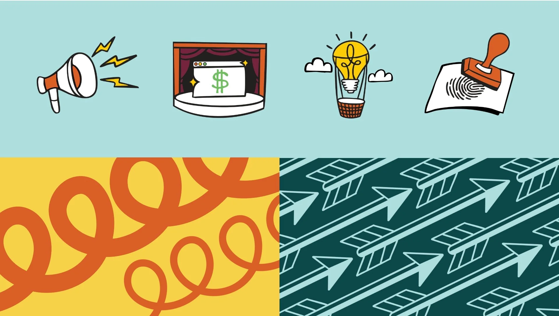
The Solution: I created a Brand Toolkit that can scale with Gizelle yet keep the grounded vibes. The mark combines writing and upward trajectory to create an image that is playful yet refined. I also created custom icons to help potential customers visualize Gizelle’s range of services. The resulting toolkit was loaded into Canva so that Gizelle could go forth and use all the assets to help relaunch The Copy Fletcher brand to the world.
The Copy Fletcher
Brand Toolkit

Did you know that the word “fletcher” means a maker of arrows?
✨ Ready to add some sparkle to your brand?
✨ Ready to add some sparkle to your brand?