

The Brief: The Source is a whimsical store with a collection of curated artistry, decor, and gifts where you are invited to slow down and discover inspiration in a shop that evolves often. After being located in a small house on the outskirts of trendy Broad Ripple Village for a few years, The Source made the move to the main street in early 2026 and wanted to completely redefine themselves.
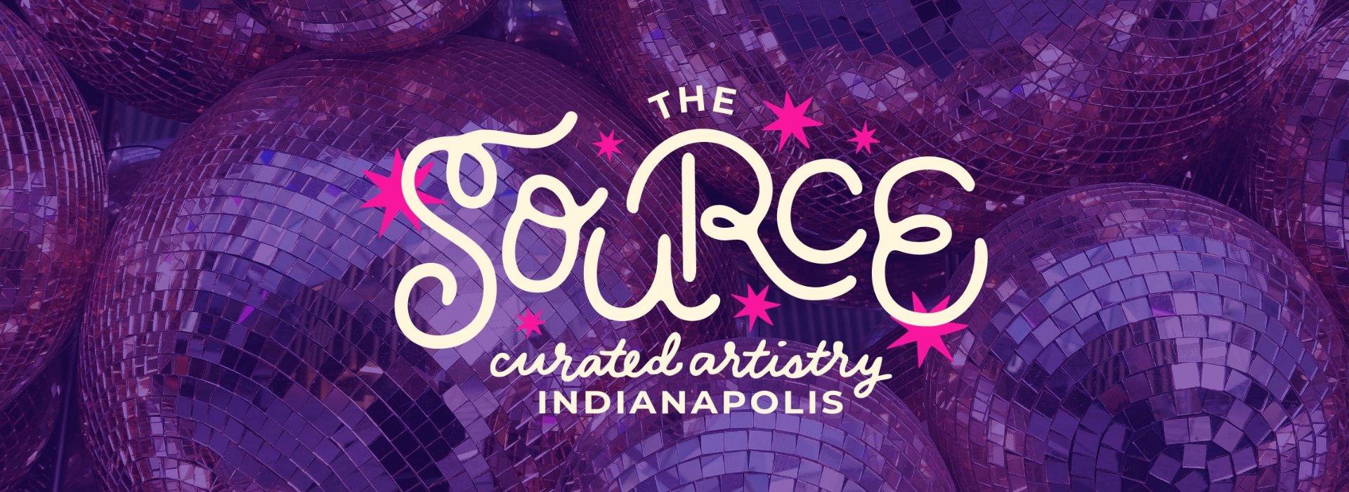
The Solution: The Source is never the same store twice so I wanted to create a brand that could evolve as they do. As our world turns into a gray wasteland of AI data centers, The Source is actively fighting against it with humanity, whimsy, and COLOR. The Source logo is hand-lettered and imperfect to reflect the hand-made goods you can find in the shop. The logo and its color palette are imperfect and meant to be re-drawn and layered with risograph printing, on a chalkboard, with construction paper, or however else you can dream up. This brand is not meant to be rigid or sterile, it’s meant to malleable.
The Source
Rebrand & Brand Toolkit
The Source’s full brand toolkit includes several re-colored versions of the full logo suite for maximum creative combinations. This brand is not meant to be rigid. It’s an art store after all!
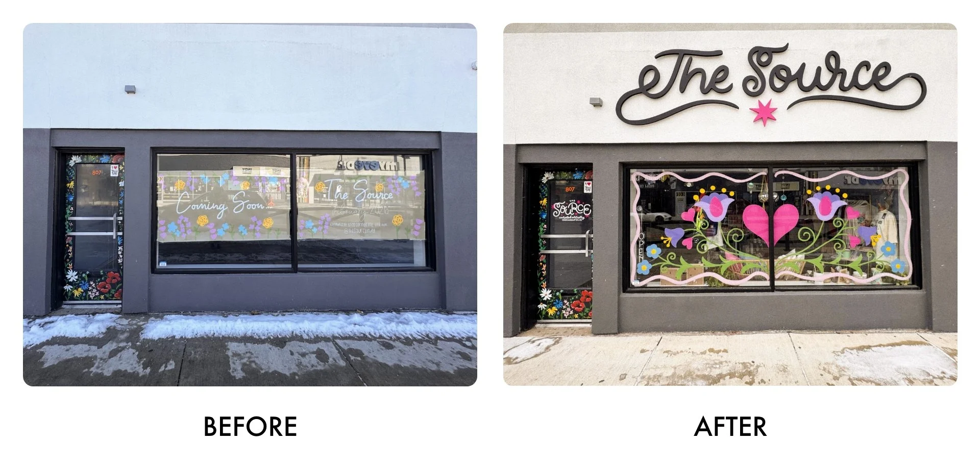
I helped bring their storefront to life with signage and custom window art just in time for their Grand Opening.
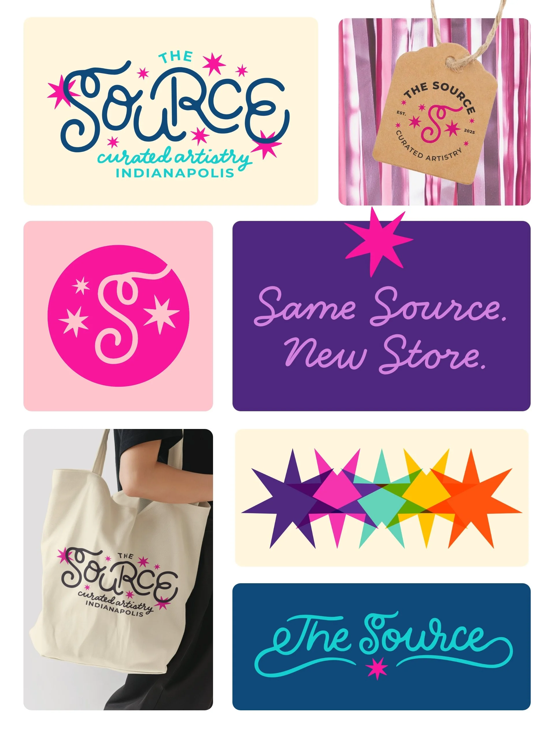
The color palette is bright, bold, and meant to be combined and layered.
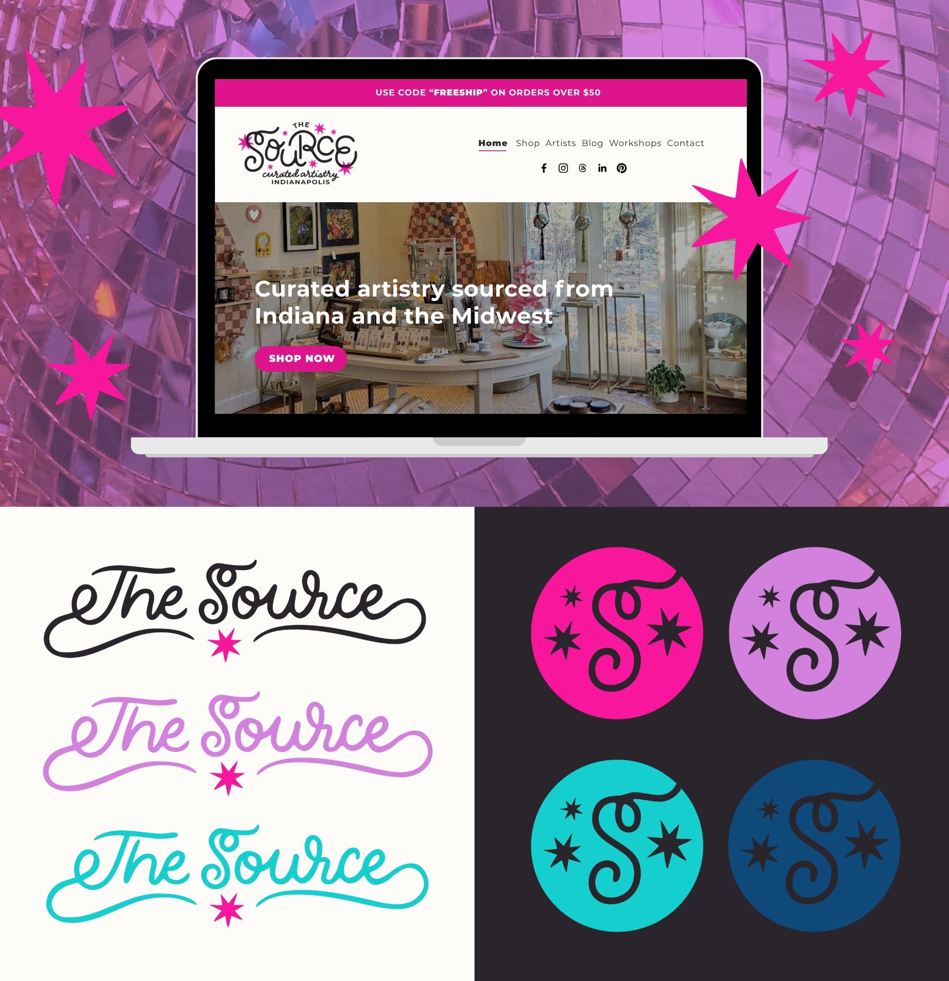
The Source Brand Toolkit features horizontal and badge versions of the hand-lettered logo for multi-purpose use.
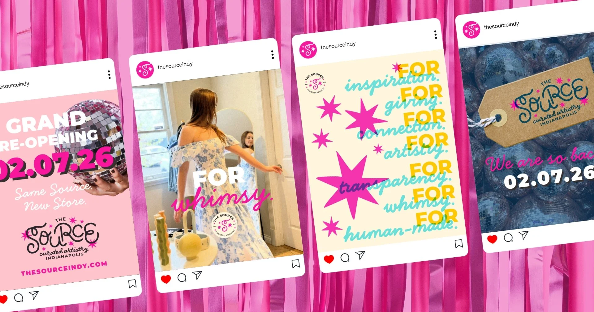
All variations of The Source logo are tied together by a very important symbol: a 7-pointed star that symbolizes the values of the collective and what you can expect when you visit their store.
1.) The Source for inspiration.
2.) The Source for giving.
3.) The Source for connection.
4.) The Source for artistry.
5.) The Source for transparency.
6.) The Source for whimsy.
7.) The Source for human-made goods.